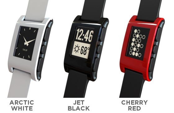
People who have higher expectations from a smart watch are calling Pebble ugly, overpriced, and clunky. Pebble Smartwatch with a non-colour, non-touch screen is sure to have something impressive in it. Let’s take a deeper delve into it.
The day it was launched…
The Pebble Smartwatch was launched way back in January 2013 at the Consumer Electronics Show. Since then there has been a flood of products similar in look and technology. But even after these 18 months, the Pebble is giving a tough competition to LG G Watch and Samsung Gear Live. Both its competitors are based on the Android Wear platform. There is yet a launch strong enough to be able to knock the Pebble off the throne. The way the Pebble notifies of calls, messages, and appointments, seems to satisfy the users to stick with it for some time more.
What’s wrong with the design?
The Pebble sports a simple and understated design. That’s may be because much emphasis has been given to the functionality than the look of the device. However, many Pebble fans claim that it has much better looks than the thick Martian Passport Smartwatch.
A closer look at the watch will tell you that the plastic casing feels hollow. In addition to that, the buttons along the sides of the watch feel mushy. These prevent the Pebble Smartwatch to have a rock-solid design. To add to that there is the polyurethane band that the watch comes with it deprives the watch of that “Wow” factor. But you can always change the band with any standard 22mm watchband.
Pebble says it with features
The Smartwatch comes in black, white, orange, red, and grey. Choose the color of your choice to flaunt your new smart gadget the way you want! On the left side of the device there is a single button that brings the user to the Menu page. On the right side of the watch there are navigation and select buttons. Tapping on any of the buttons on the Pebble lights up the backlight. You can do that with the flicks of your wrist too. The watch has a really impressive touch. Like the standard watches, this watch too has a face that is customizable. You can choose between nine different face styles – from conventional analogue to futuristic dot matrix.
The Pebble Smartwatch has a 1.26-inch display with 168 pixel e-paper display. However, it isn’t the sharpest or the clearest around. Anyway, it gets the job done well. Do not expect to see a clear image that E-Ink creates on devices like Kindle Paperwhite. You must know that the Pebble Smartwatch doesn’t have a full 180 degrees view it’s hard to read the watch if you look at it from an angle. With a reflective screen, it is difficult to read the watch out in bright outdoor settings.
A good thing about this watch is that it is compatible with both Android and iOS devices. So, if you are planning to hop into the Smartwatch bandwagon, the Pebble Smartwatch can be your best bet.
Author’s Bio: Matt is a techie with special interest in mobile apps. He is currently using an English dictionary app and is always on the lookout for new applications.


